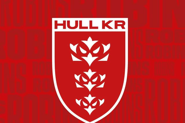
Hull KR "rise again" with new club crest
The Super League club, who aim to put one foot into the play-offs when they host Castleford Tigers tomorrow, have revealed their new-look badge ahead of the 2022 season and in readiness for their 140th anniversary.
Although ‘Kingston’ has been dropped from its previous incarnation, the design does now incorporate a robin with a nod to the East Yorkshire club’s famous nickname.
Advertisement
Hide AdAdvertisement
Hide AdSporting the traditional shield shape alongside the famous red and white, the new identity also features the three crowns representing Kingston Upon Hull with a unique robin twist.
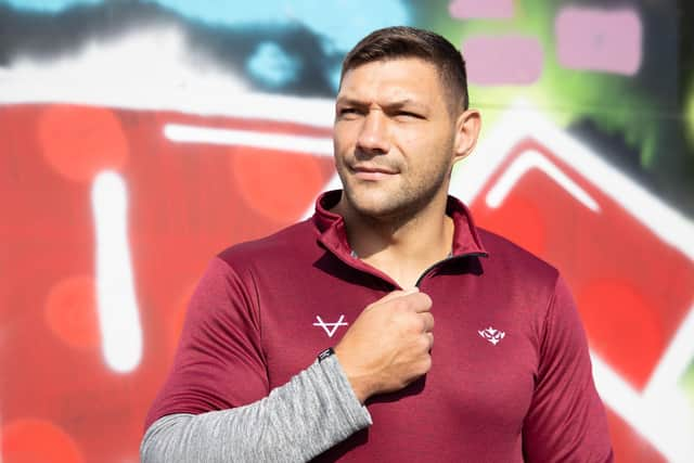
“Fans will be seeing the green shoots of progress on and off the field that we are starting to show,” said Rovers CEO Paul Lakin, with the squad having turned matters around after finishing bottom last term and the club introducing bold new concepts like their Craven Streat fans village.
“We know we have a long way to go, but if we have genuine ambitions to establish ourselves as an even stronger force in the sport, we have to evolve and modernise everything we do.
“Whilst we all love the old crest we have grown up with, it is a monologue brand in a digital world; it’s no longer fit for purpose.
Advertisement
Hide AdAdvertisement
Hide Ad“To achieve the cut through we need in the digital and commercial world, we have to freshen up and have assets which can be tailored for each platform where we represent the club.
“Selling a baseball cap to a new fan or younger fan with three traditional crowns on it is a tough ask.
“When you lift one of those Robins out and place it on the same product then suddenly it works. It feels aspirational.”
Hull KR are the latest Super League club to undergo a rebrand after Wigan Warriors launched their own new club badge last year.
Advertisement
Hide AdAdvertisement
Hide AdThe process to evolve has seen fans from aged four to 75 involved, extensive feedback from sponsors, former players and marketing experts consulted.

Hundreds of variations and approaches were considered but in the consultation period a favourite route became clear with the club keen to remain authentic and true to its history.
Driven by the club’s head of marketing Craig Franklin, and developed by renowned marketing agency Nomad who were behind the FA Premier League rebrand, the task of evolving one of the sport’s most iconic names and recognisable badges has been an extensive process.
Franklin said: “During the consultation period we had some groups who said the shield shape and retaining the three crowns were non-negotiable.
Advertisement
Hide AdAdvertisement
Hide Ad“Yet at the other extreme we had groups that were happy to completely overhaul and wanted us to be bold and brave and move to an NFL style Robin character.
“With what we’ve developed we feel we’ve found the perfect balance between the two.
“It allows us to clean things up in certain areas, achieve cut through on digital and broadcast, yet retain a more traditional looking crest for the shirt and other traditional media.
“I know what this badge means to people and what it represents, including my family.
Advertisement
Hide AdAdvertisement
Hide Ad“I grew up on these terraces with them, and I knew we had to find a balance, so we were authentic to ourselves and who we represent, yet move us forwards.
“I’m confident the final version is a true modern reflection of the club and will stand the test of time as we enter an exciting new chapter of our history.”
Comment Guidelines
National World encourages reader discussion on our stories. User feedback, insights and back-and-forth exchanges add a rich layer of context to reporting. Please review our Community Guidelines before commenting.